SAPPORO Black
Experience the darker side of Sapporo.
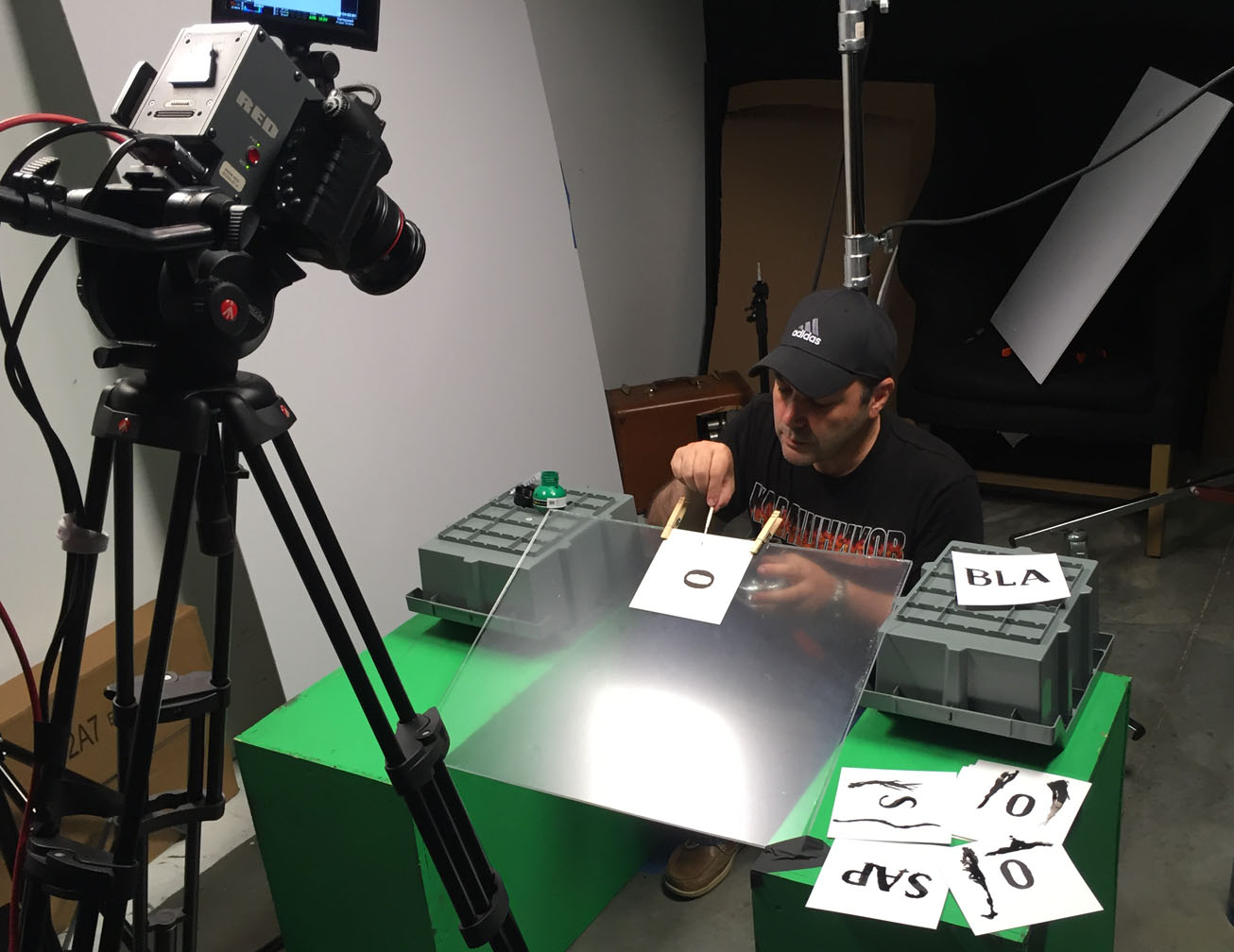
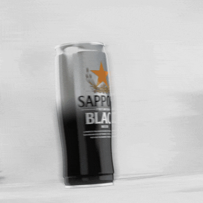
Our first Sapporo adventure with Moosylvania was a big success, so naturally they brought the next opportunity right to us. This time, it was a :15 spot, with a much smaller budget, and a set of approved boards. So even though it didn’t require a lot of our creative development and was a pretty tight turnaround, it also meant we had a much narrower target to focus on. A badass 3D beer can in a minimal environment? No problem. We even got to play around in the studio and capture some practical ink & watercolor effects!
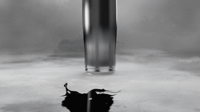
Stock ink and watercolor will only get you so far.
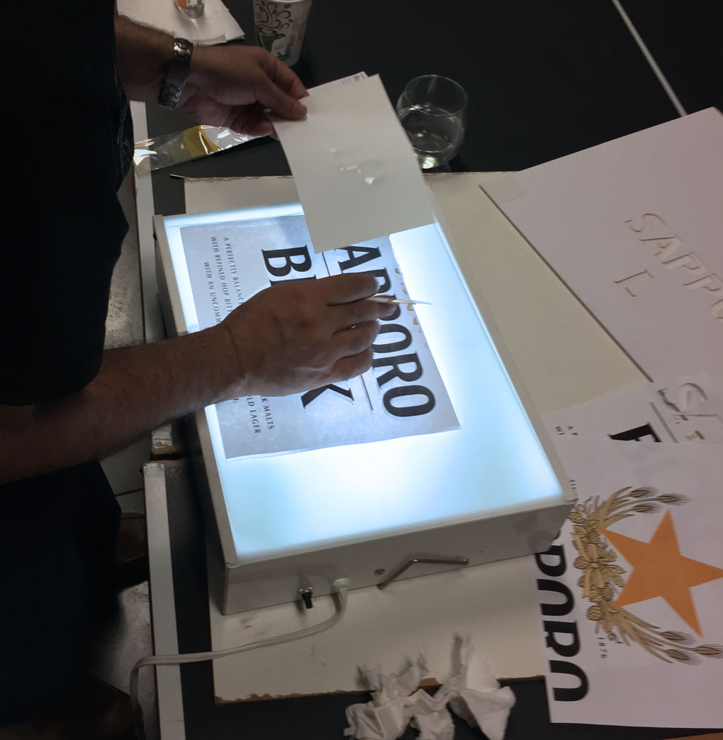
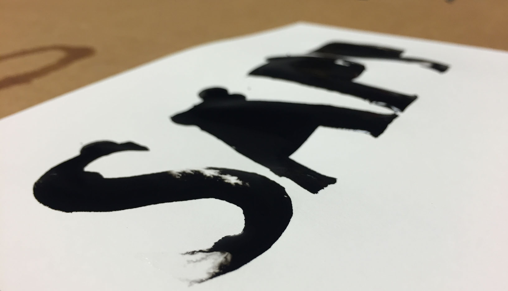
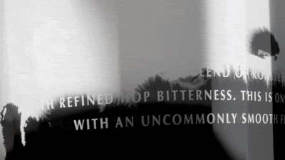
So for Sapporo Black we got out the camera and got our hands dirty. It was essential that the label art really feel like it was bleeding in, which meant making custom ink elements for each letterform. Testing out several kinds of ink and paper, we hand “painted” the label art with water, then dropped ink and let it fill in the letterforms. Then we took them into composite, combining different takes for the perfect bleed effect. Slap it onto a 3D replica of Sapporo’s iconic can, and you’ve got yourself a commercial.