MLS St. Louis City SC
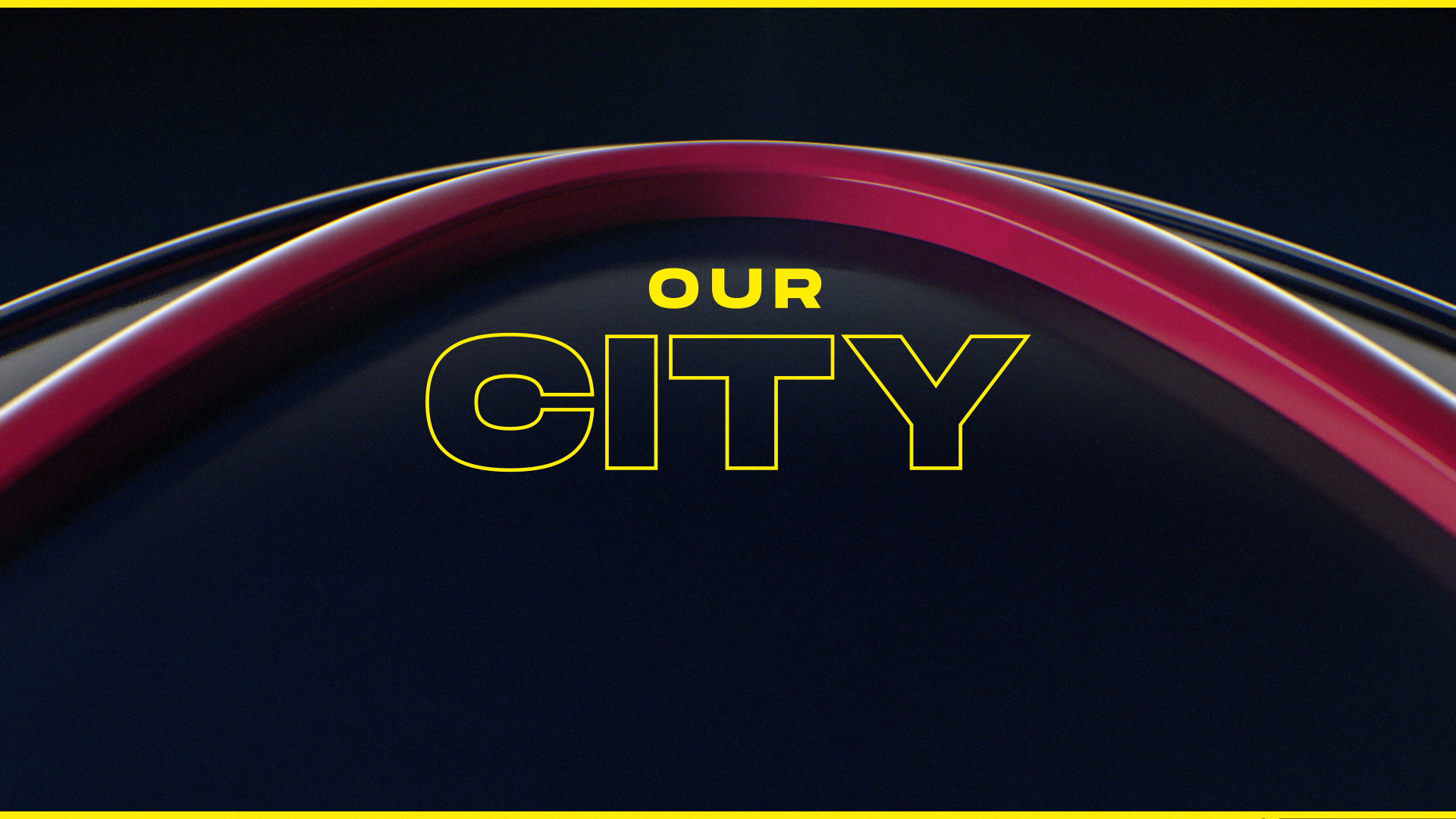
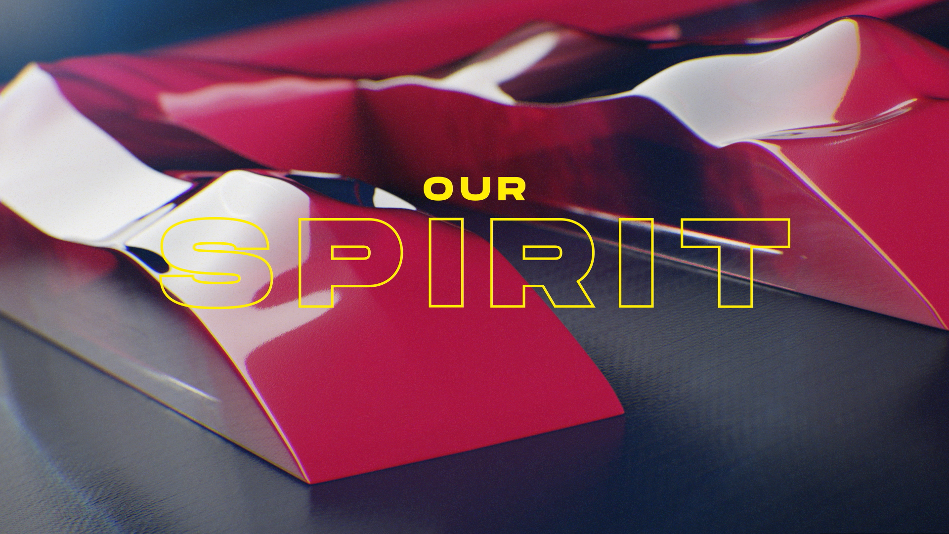
Our City. Our Spirit.
My friends at Cannonball brought me an incredible opportunity: help unveil the branding for St. Louis’ official MLS team.
After years of hoping, St. Louis was finally awarded an MLS team in 2019. STL soccer fans rejoiced, but had to wait another year before learning the team’s name, colors, and crest. The big reveal required a ton of content: brand films, short-form teasers, social content, logo animations, and more.
My tasks included:
Art + Motion Direction
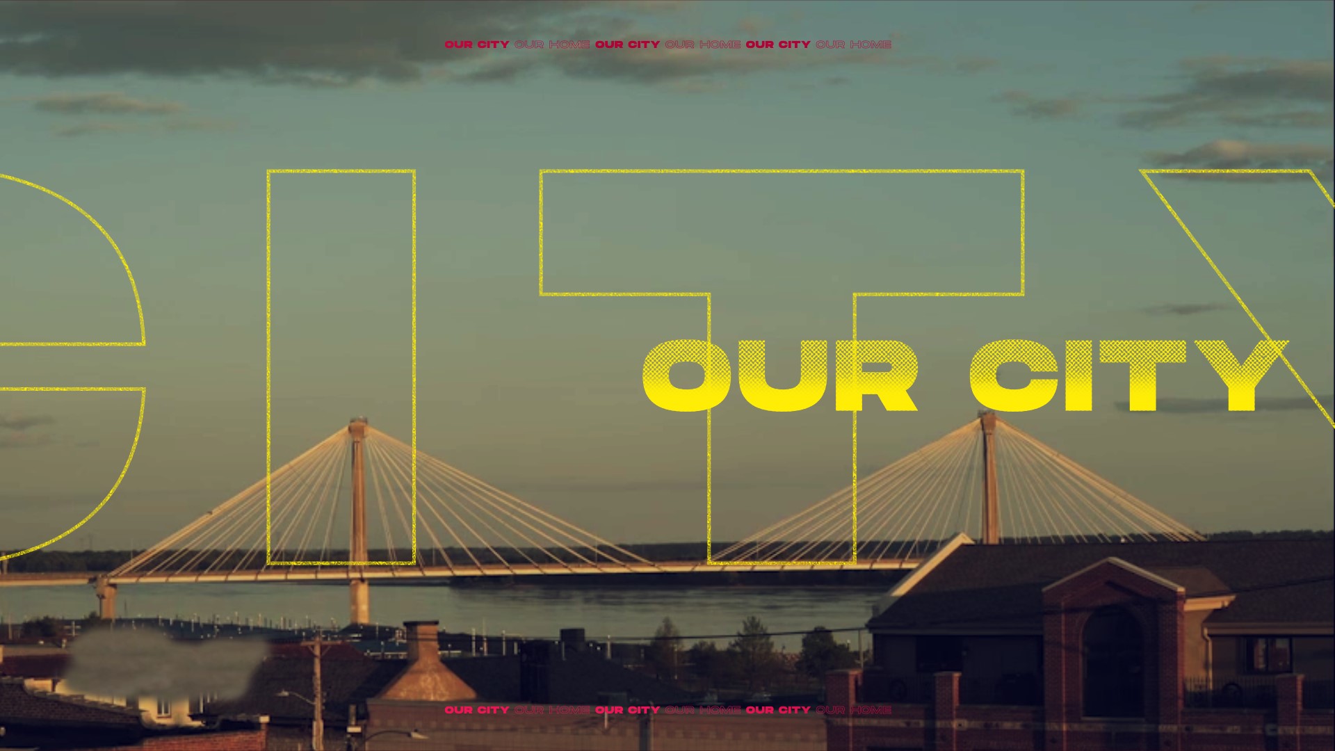
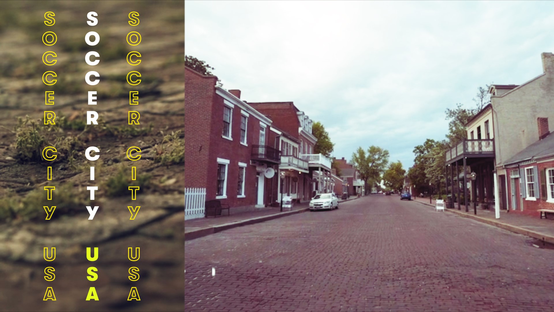
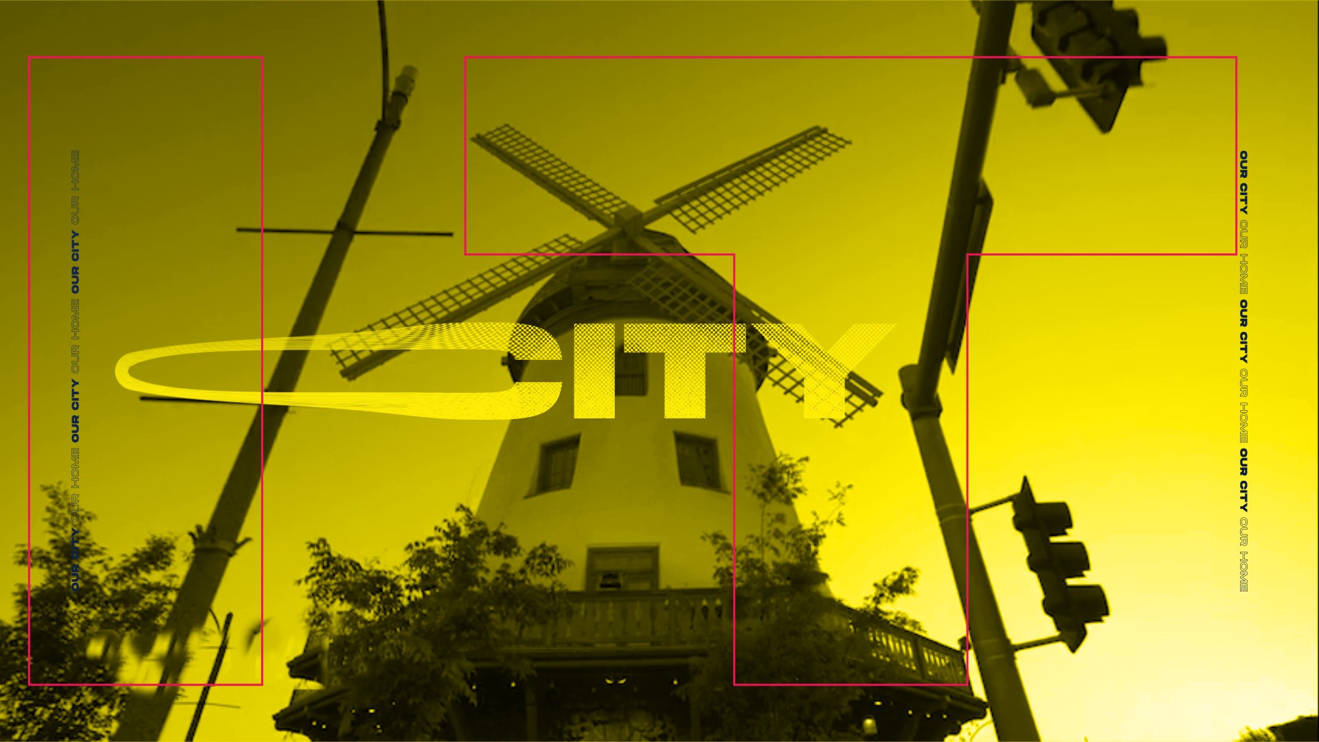
Help establish the visual tone for the brand films + social content
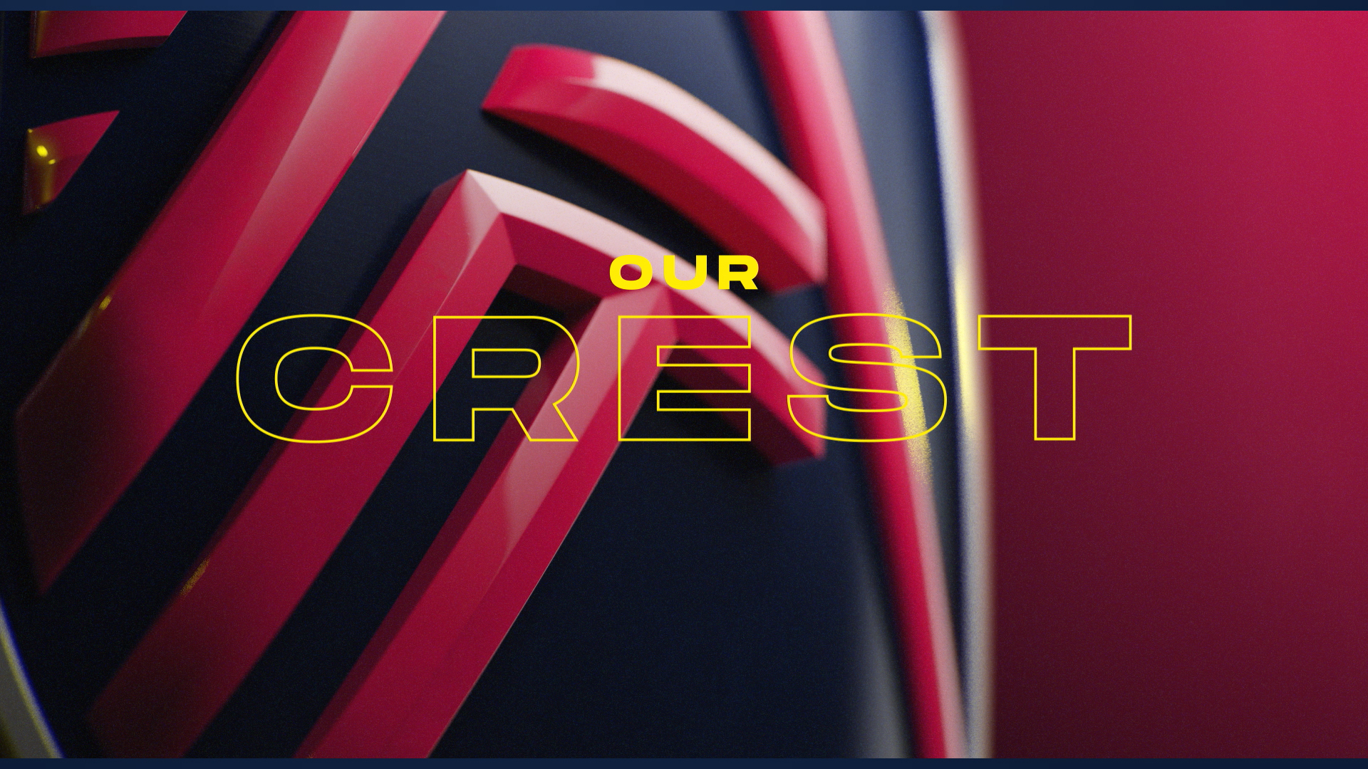
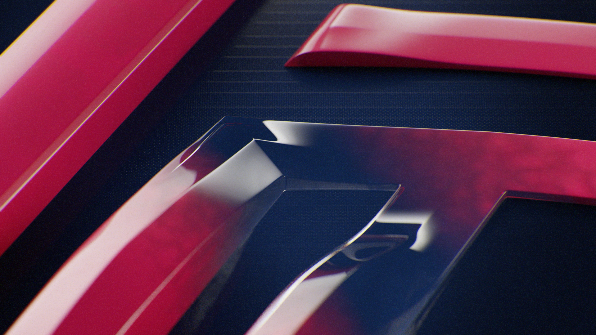
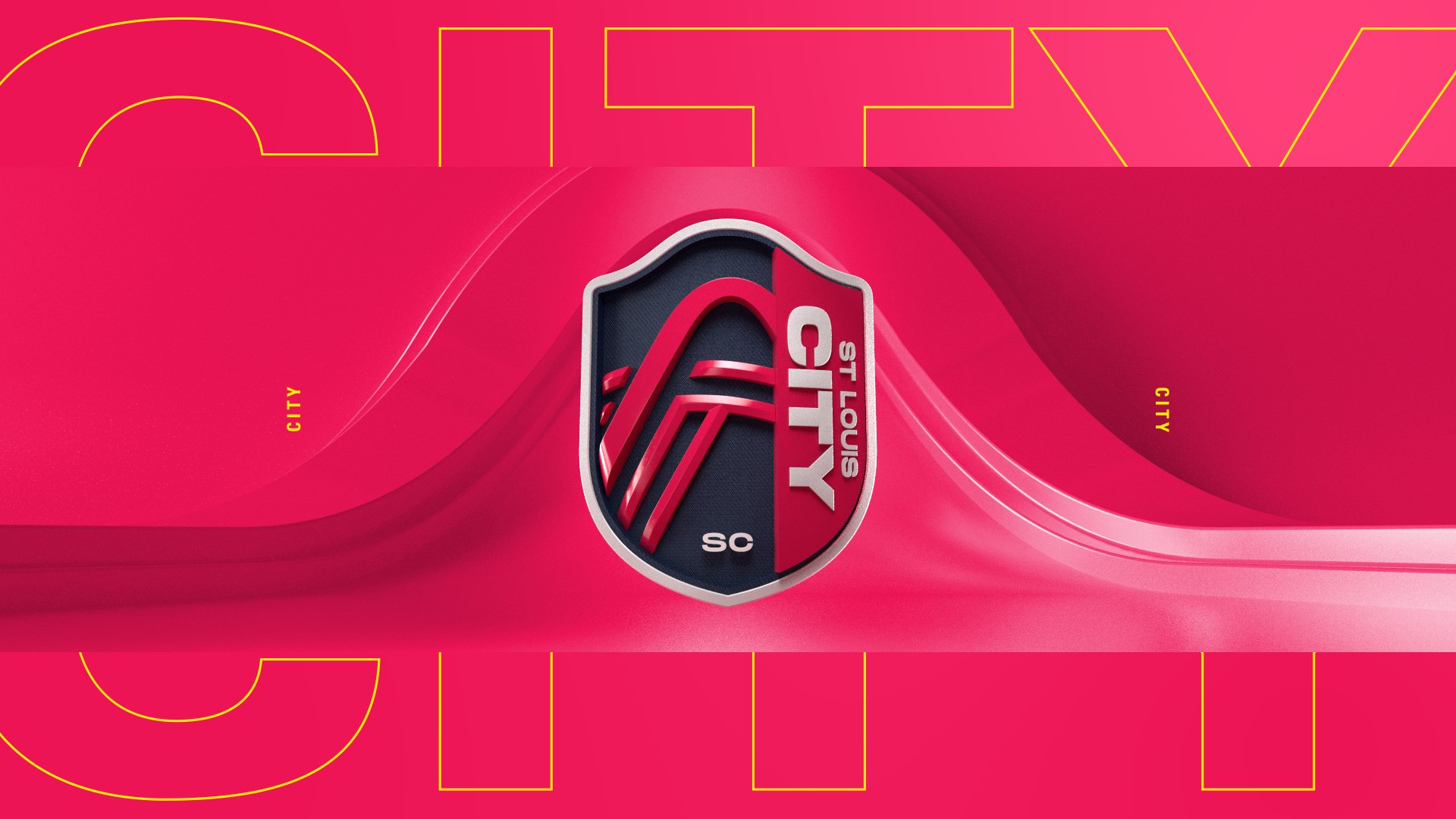
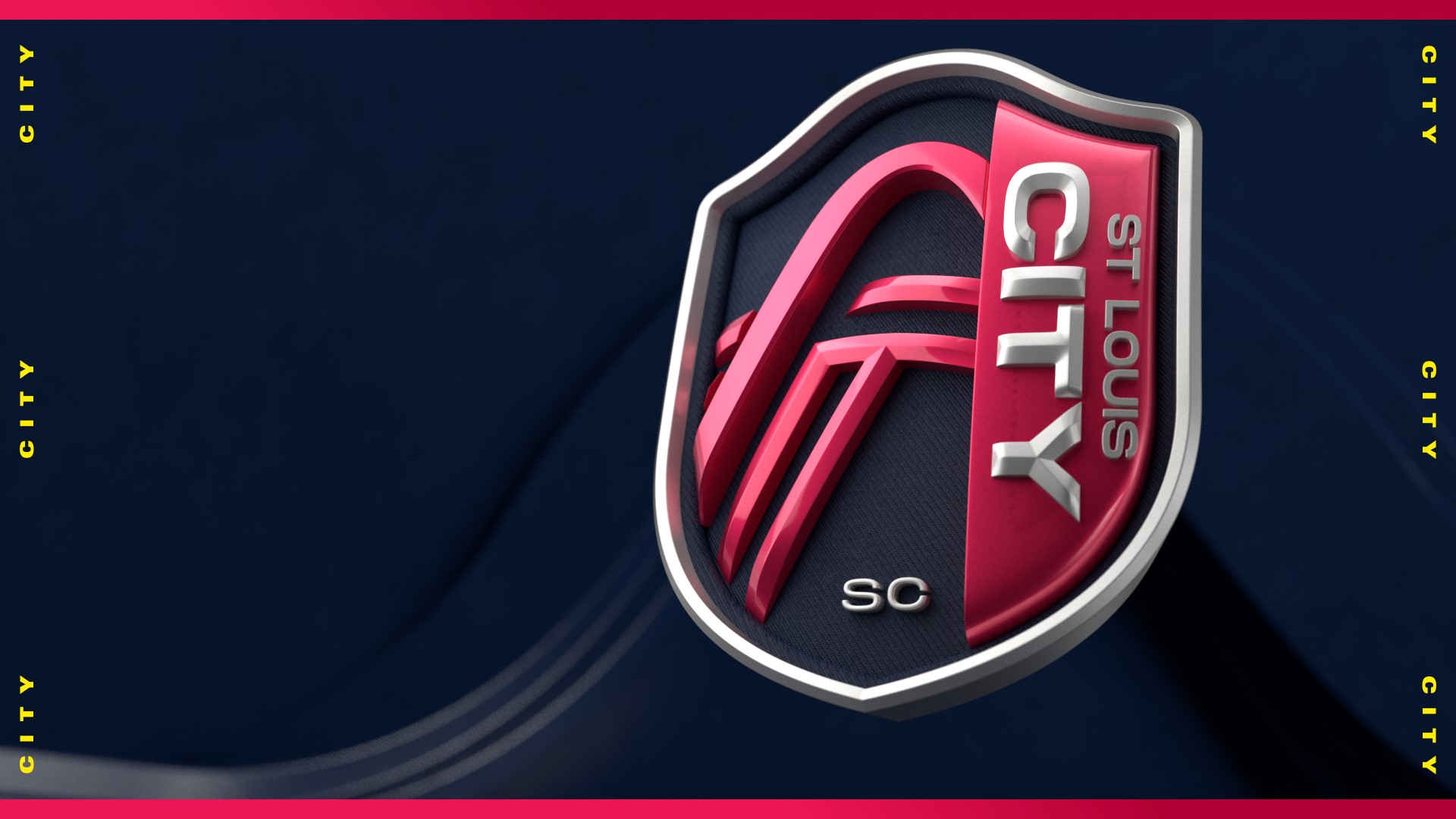
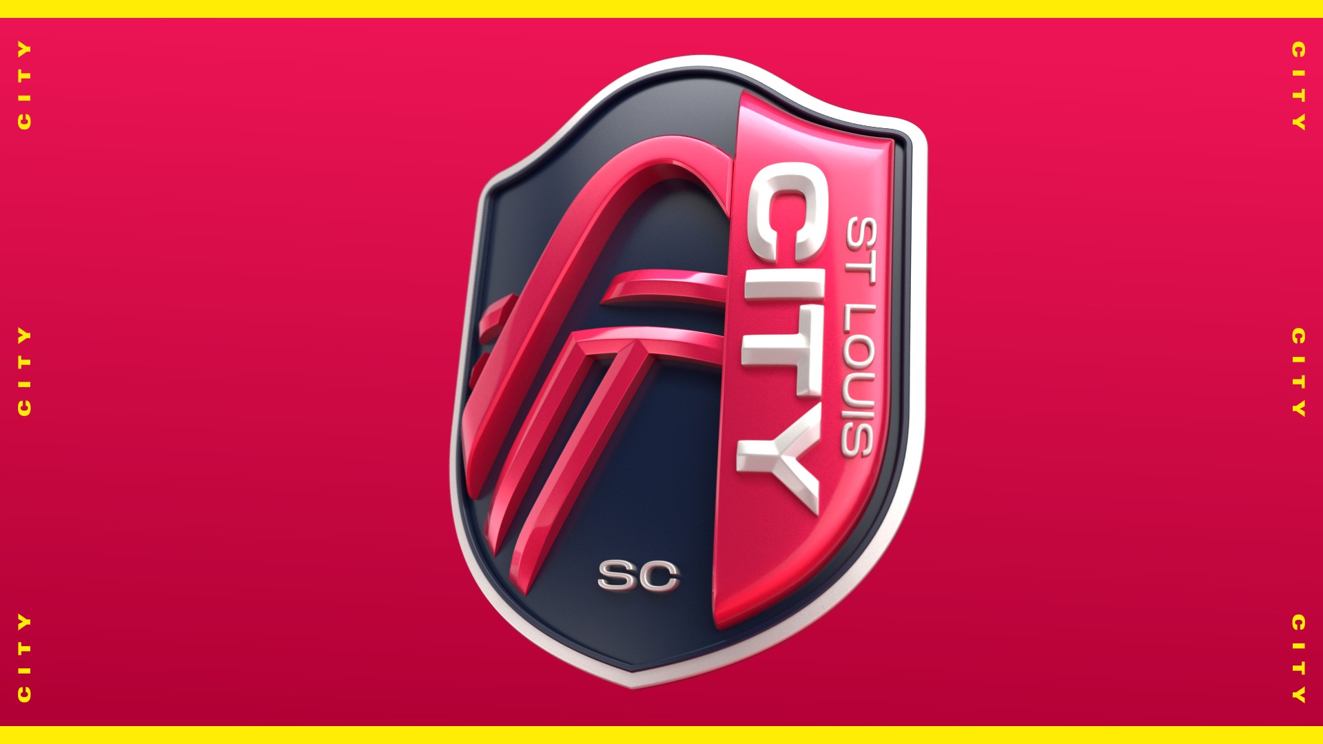
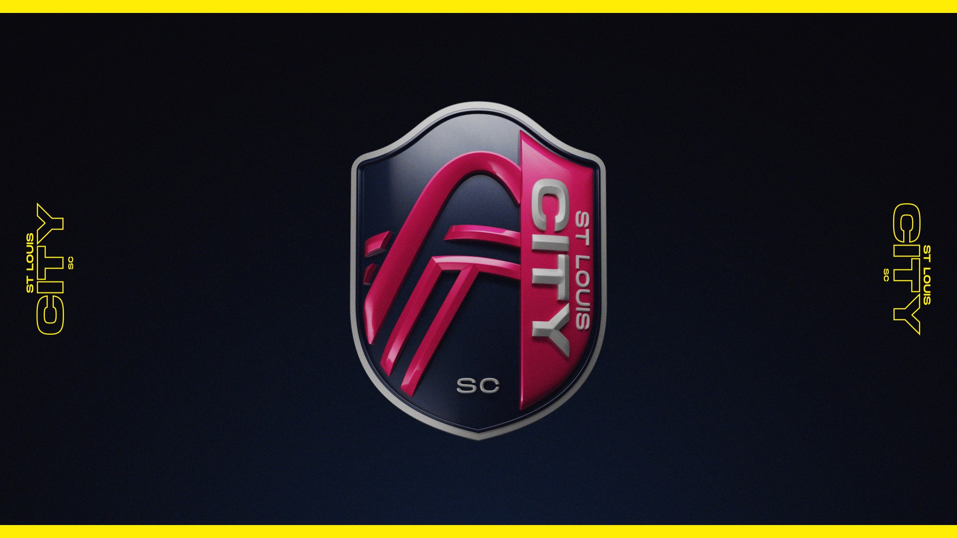
3D CITY Crest
Bring the team’s crest to life in 3D, for a dramatic reveal
2D Brand Animations
Introduce the team’s branding via energetic 2D animation loops
3D Crest
I developed a 3D version of the team’s crest, and created a 30-second dramatic reveal animation.
It was used for the hero section at the end of the main brand film, as well as a standalone piece.


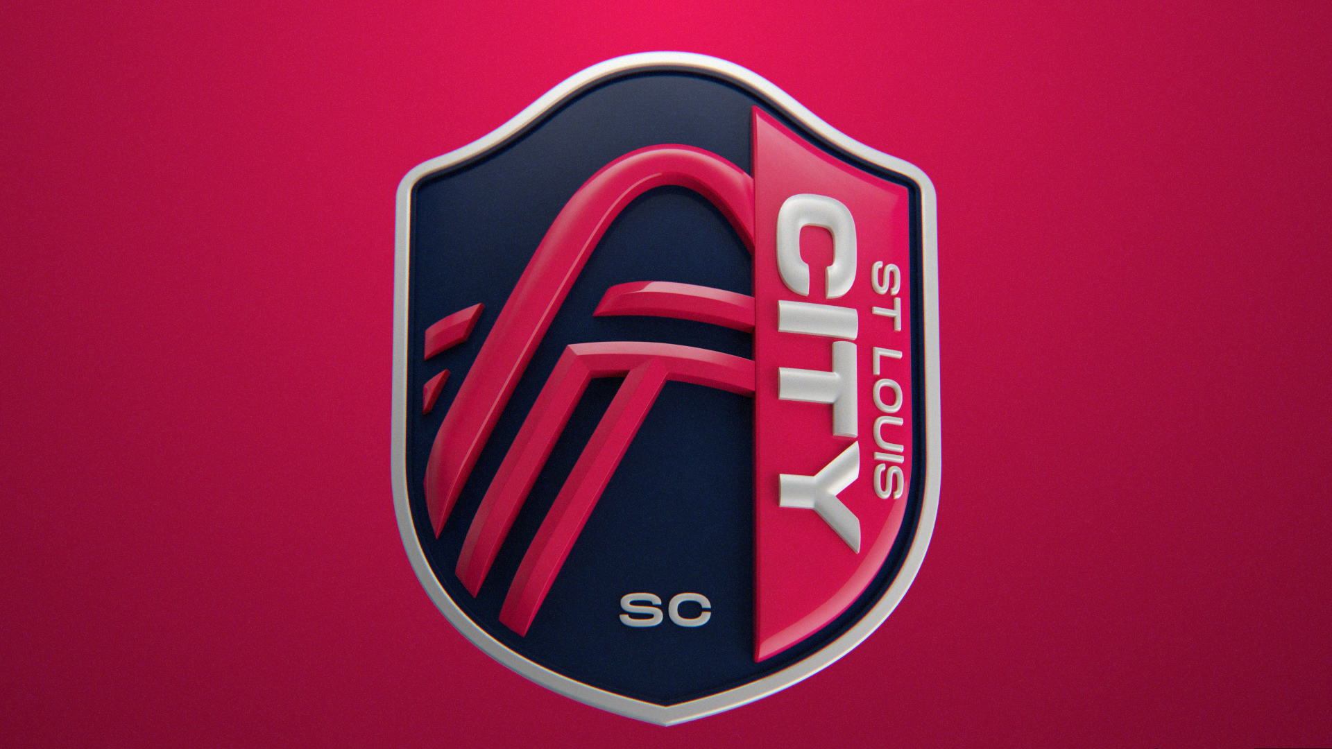
Look Development
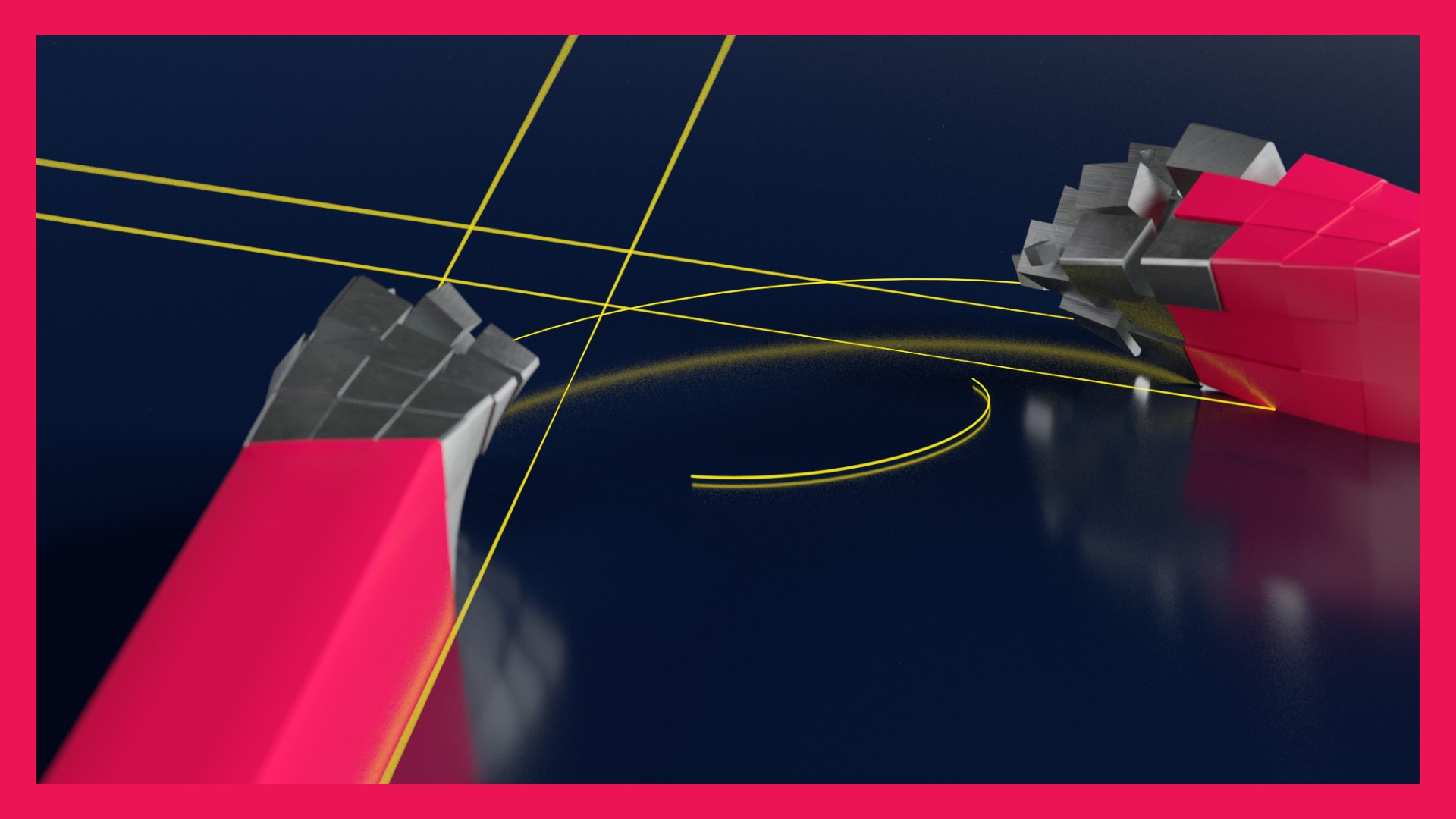
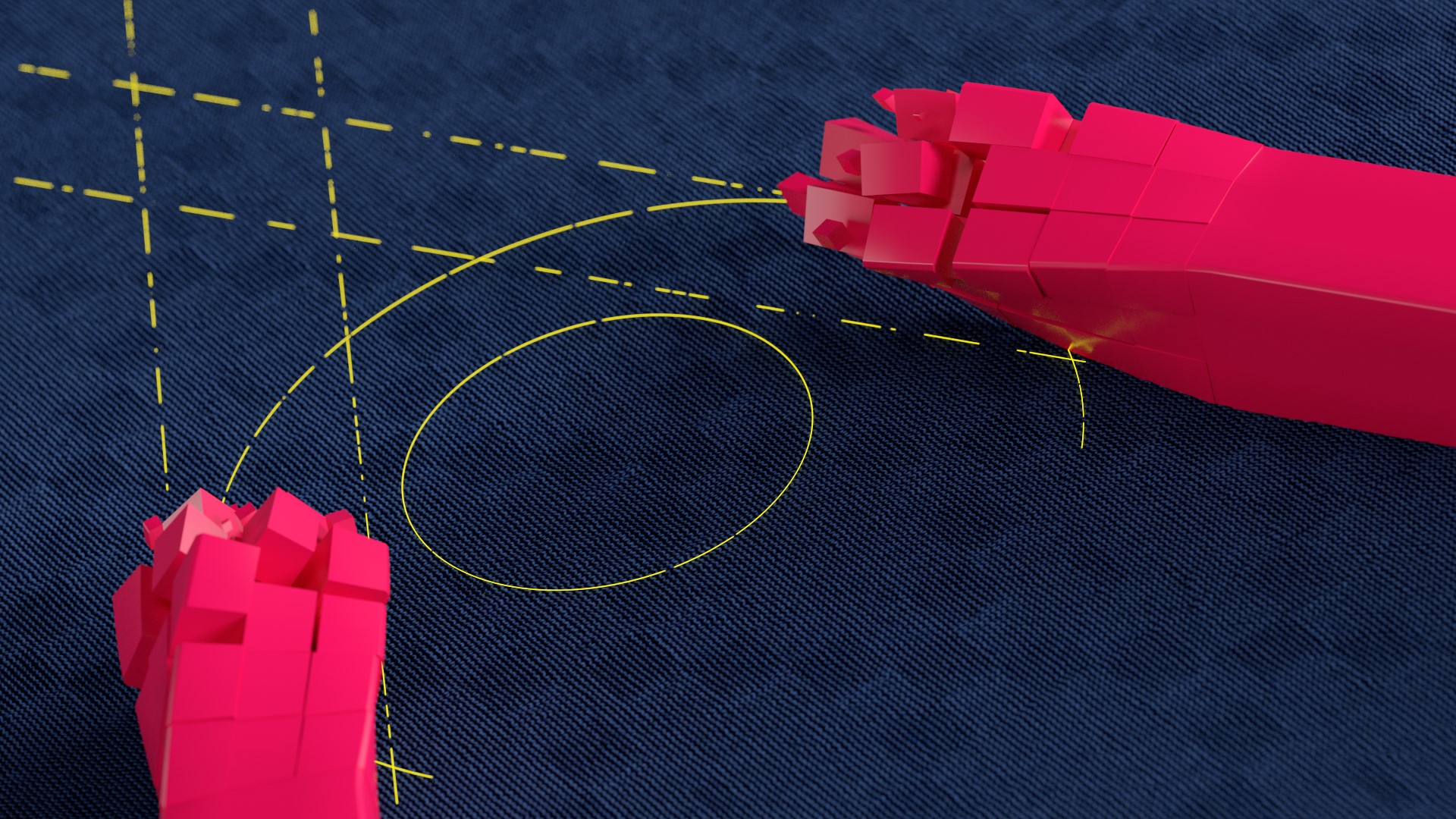
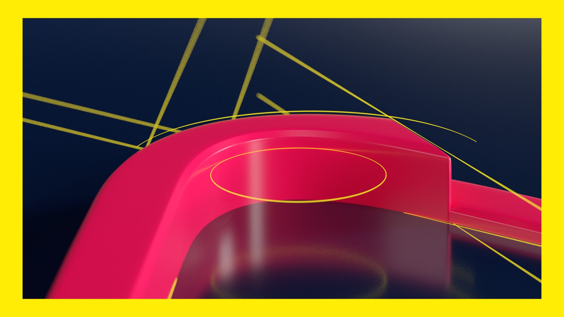
Since this would be the first look at the brand’s crest + colors I needed to be sure it all came through very clearly, but I didn’t want to end up feeling too playful. It was a bit of a challenge to find the right balance of edgy / athletic / graphical. I explored a wide range of materials (metals, plastics, fabrics) and lighting approaches (moody / dark vs. bold/ bright).
I landed on a high contrast cinematic look to make the reveal dramatic, and used typography and graphic overlays to re-enforce the branding.
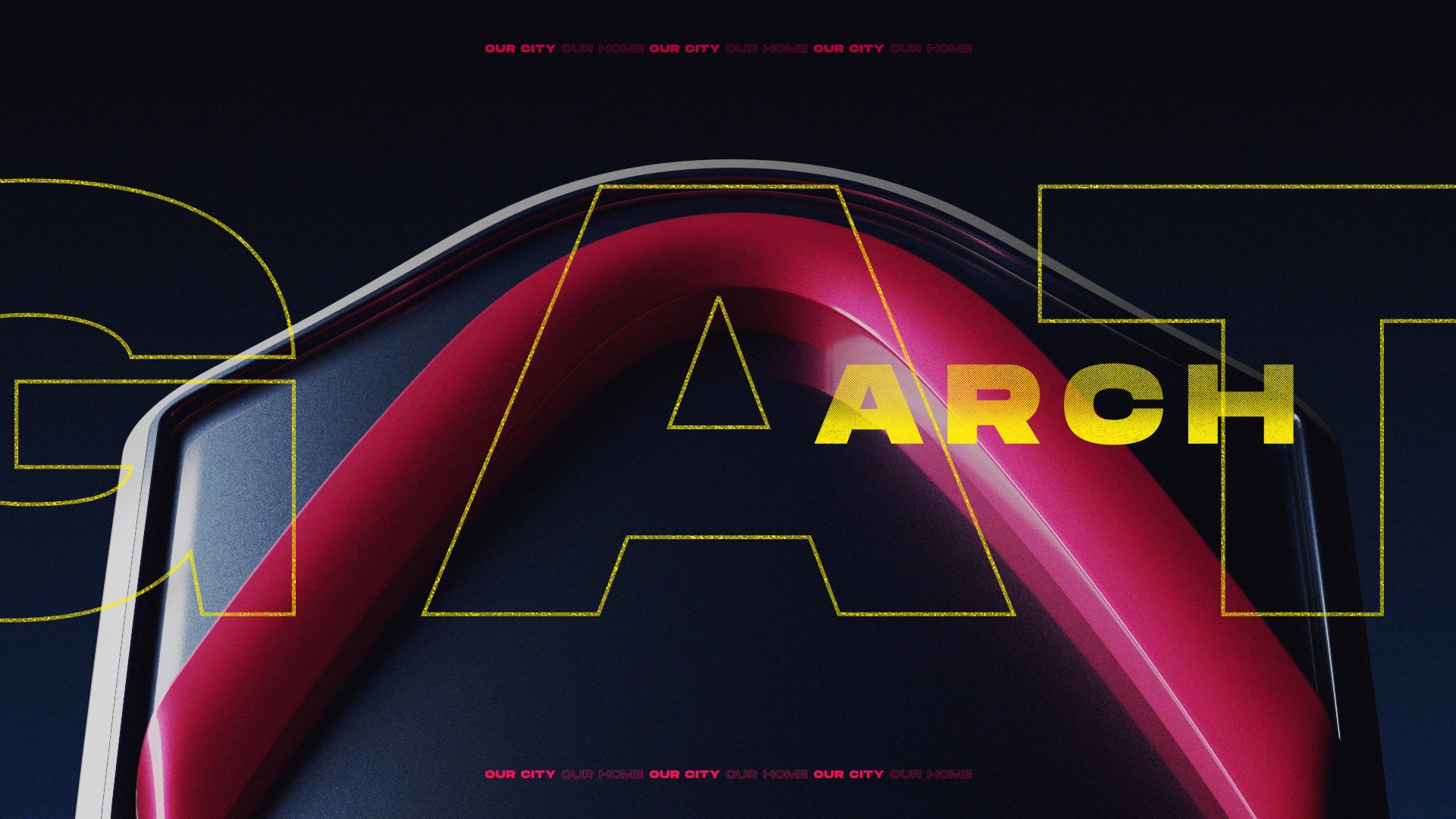
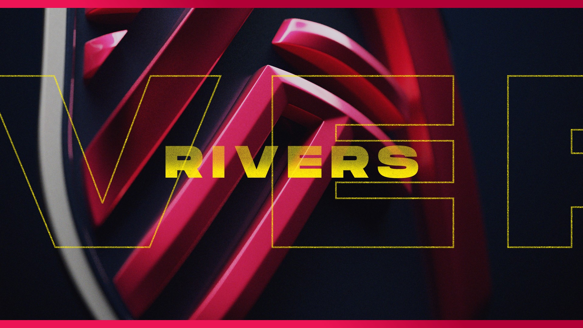
Early styleframes
Animation
I also explored several approaches for animating / revealing the crest elements. We’d talked early on about highlighting the construction of the crest like a graphic designer’s case study, or a building blueprint. I ultimately tossed most of these — they felt wrong given the more photographic look I was trying to establish. I ended up sticking with simple rising / revealing motion, and used the 2D graphic overlays to create dynamic energy.
Some of the more “mography” explorations

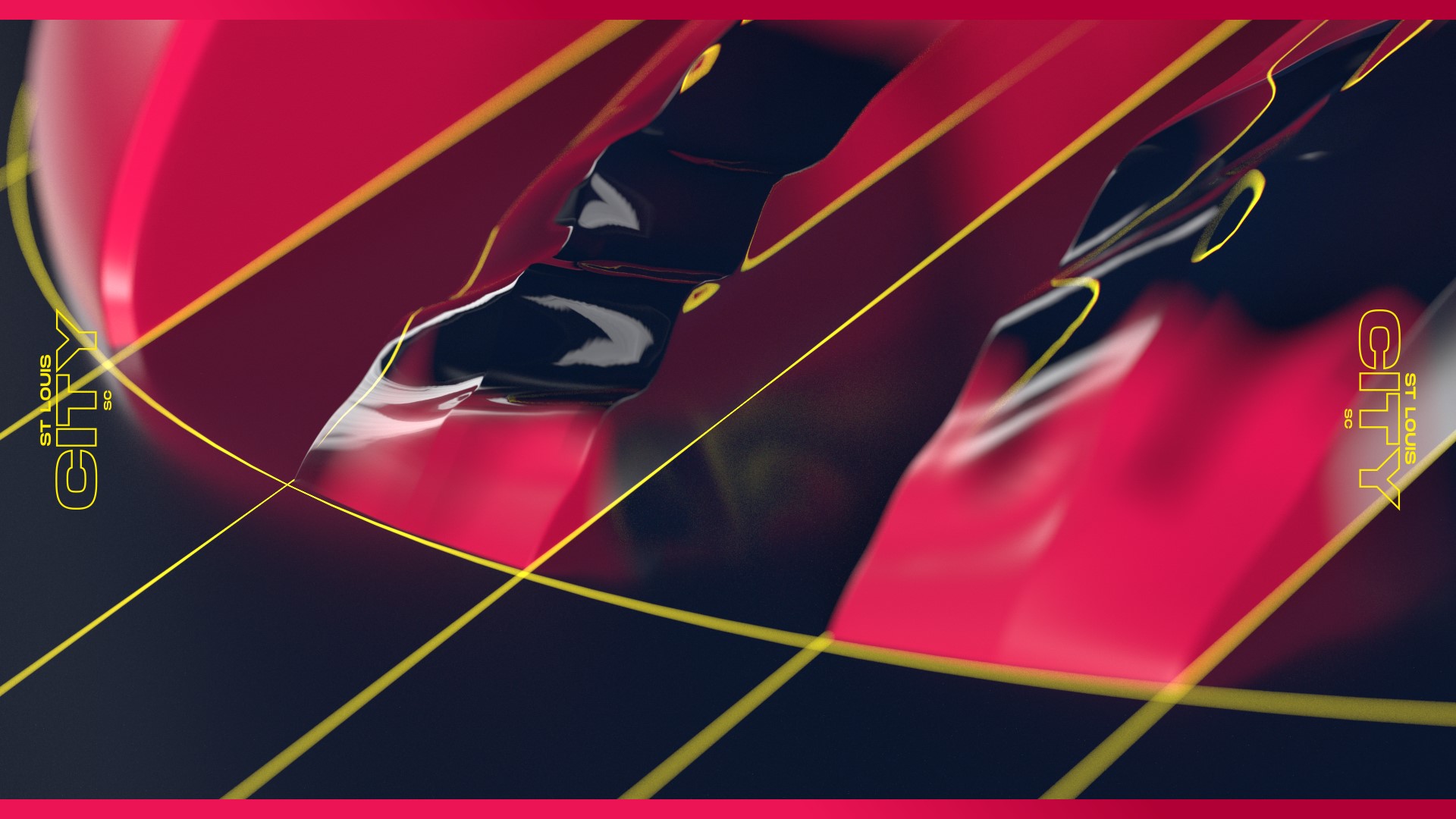
Tying it all together
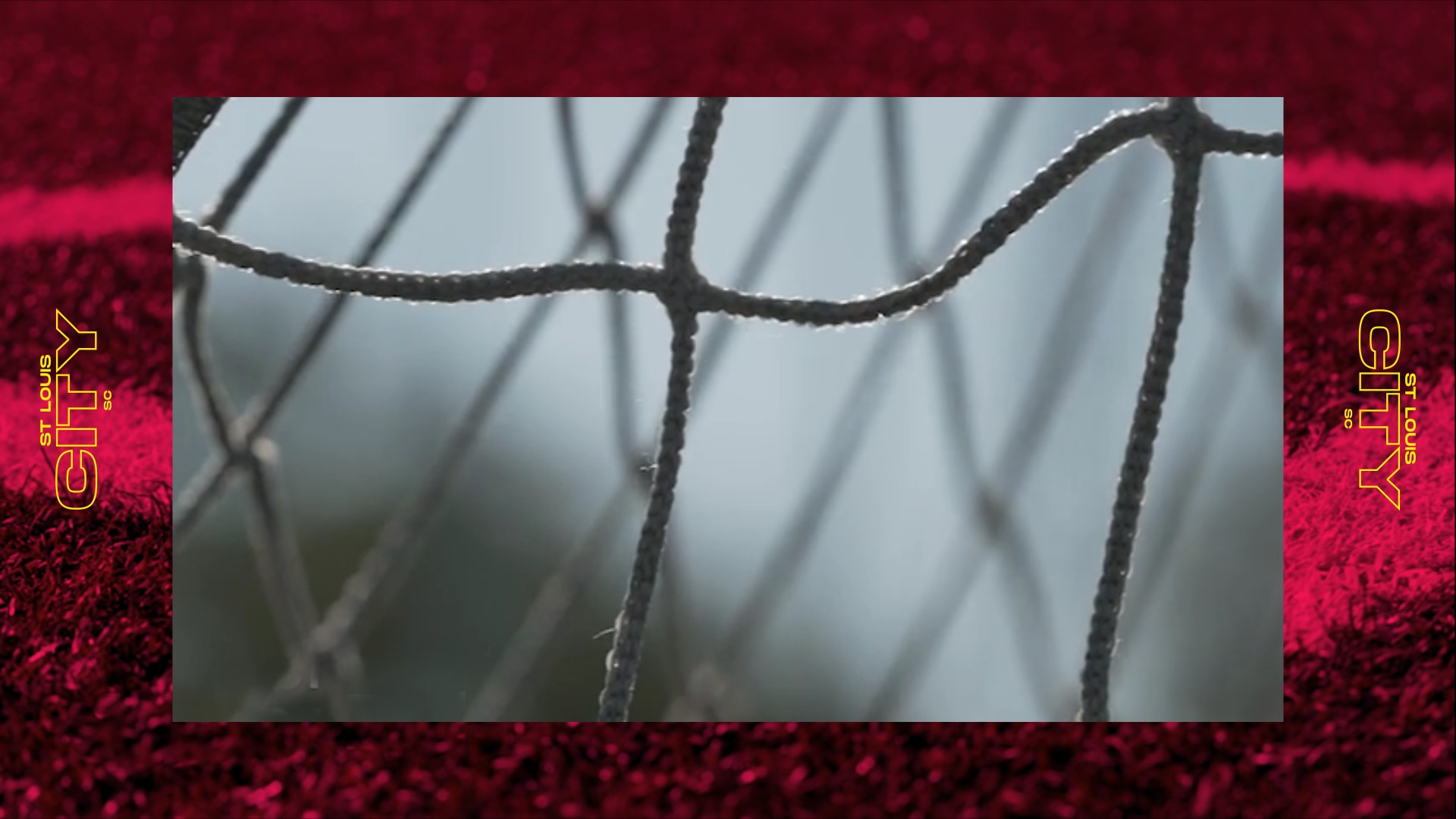
Another challenge was making sure the film — primarily footage with a 3D Crest section at the end — felt cohesive. I relied on typography, color washes, and graphic overlays to tie everything together.